Call: 1-916-358-6449

Are you tired of potential customers visiting your website and quickly clicking away because it doesn’t look good on their mobile devices? In today’s digital age, having a responsive website is crucial for the success of your business. Not only does it provide a seamless user experience across all devices, but it also helps improve your search engine rankings. So, if you want to stay ahead of the competition and attract more visitors to your site, it’s time to hire a responsive web designer. In this blog post, we’ll explore what responsive web design is, its benefits, and why your business needs a talented professional in this field. Get ready to transform your online presence and take your business to new heights!
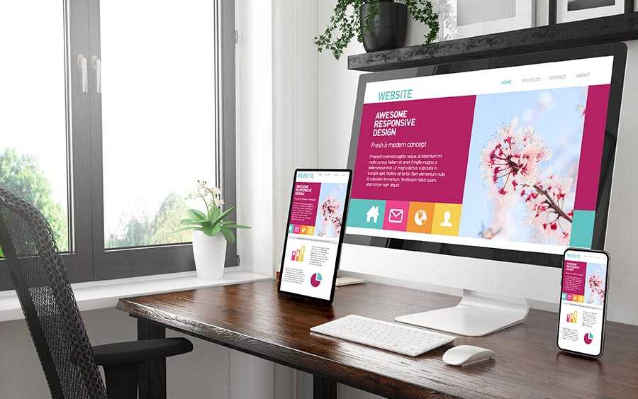
Responsive web design is a design approach that ensures your website looks and functions seamlessly on various screen sizes and devices, including desktop computers, tablets, and smartphones. In other words, it adapts to the user’s device automatically.
The key principle of responsive web design is fluidity. Instead of creating multiple versions of your website for different devices, a responsive design uses flexible grids and layouts that adjust proportionally based on the screen size. This means that no matter how big or small the device is, your website will always look visually appealing and be easy to navigate.
One important aspect of responsive web design is its ability to prioritize content based on the device being used. For example, if someone accesses your site from their mobile phone, they may not need all the same information as someone browsing from a desktop computer. Responsive design allows you to optimize content visibility for each specific device.
To achieve responsiveness in web design, designers use CSS media queries and HTML5 elements such as fluid grids and flexible images. These techniques allow them to control how elements are displayed depending on factors like screen resolution and orientation.
Responsive web design is an essential strategy for modern businesses aiming to create a user-friendly online presence across all devices. It ensures that users have a positive experience while interacting with your website regardless of whether they’re using a smartphone during their daily commute or sitting at their desk with a laptop in hand.
One of the key benefits of responsive web design is that it allows your website to adapt and adjust its layout based on the device being used to view it. This means that whether someone is accessing your site from a desktop computer, a tablet, or a smartphone, they will have an optimal viewing experience.
Having a responsive website can greatly improve user experience. With more people now browsing the internet on their mobile devices, it’s crucial that your site looks good and functions well on smaller screens. A responsive design ensures that users can easily navigate through your site and access all its features without having to constantly zoom in and out or scroll horizontally.
Another advantage of responsive web design is improved search engine optimization (SEO). Responsive sites tend to rank higher in search results because they provide better user experiences across different devices. Search engines like Google prioritize websites that are mobile-friendly and penalize those with poor mobile usability.
In addition, having a responsive website can save you time and money in the long run. Rather than maintaining separate websites for desktop and mobile users, you only need one site with a responsive design. This makes updates and changes much easier since you only have one set of code to manage.
Investing in a responsive web designer can bring numerous benefits to your business. From enhanced user experience to improved SEO rankings, this approach ensures that your website reaches as many potential customers as possible regardless of how they choose to browse the internet!
So, you’ve realized the importance of having a responsive website for your business. Now, the question is: how can you ensure that your website is indeed responsive? Well, fret not! Here are some key steps to follow:
1. Choose a responsive web design template or theme: When selecting a template or theme for your website, opt for one that is specifically designed to be responsive. This ensures that the layout and elements will adapt seamlessly across different devices.
2. Test on multiple devices and screen sizes: Don’t just rely on testing your website on one device. Make sure to test it on various smartphones, tablets, laptops, and desktops with different screen sizes and resolutions. This will help identify any issues or inconsistencies in responsiveness.
3. Utilize media queries: Media queries allow you to specify different stylesheets for different devices or screen sizes. By implementing these queries in your CSS code, you can customize the appearance of your website based on the device being used.
4. Optimize images and media files: Large image files can significantly slow down your website’s loading speed on mobile devices. To ensure optimal performance and responsiveness, compress images without compromising quality and consider using lazy loading techniques.
5. Implement flexible grids and layouts: Instead of fixed-width layouts, use percentage-based grids that adjust fluidly based on screen size.
These flexible grids enable content to reflow intelligently across screens while maintaining readability. By following these guidelines, you’ll be well-equipped to make sure that every aspect of your website is optimized for responsiveness. That way, your visitors will have a seamless browsing experience regardless of their chosen device.
And remember, a professional web designer who specializes in responsive design can further assist you in achieving an effective solution tailored specifically to meet all your business needs
Why is responsive web design important for businesses? Well, in today’s digital age, having a strong online presence is crucial for any business to succeed. And with the increasing use of mobile devices, it has become even more essential to have a website that can adapt and provide an optimal user experience across all screen sizes.
One of the main benefits of responsive web design is that it ensures your website looks great and functions properly on any device. Whether someone visits your site from their desktop computer, smartphone, or tablet, they should be able to easily navigate through your site and find what they’re looking for without any hassle.
Not only does responsive web design improve usability, but it also helps with search engine optimization (SEO). When Google ranks websites in search results, it takes into consideration whether the site is mobile-friendly. Having a responsive website can give you an edge over competitors who haven’t optimized their sites for mobile devices.
Furthermore, having a responsive website can enhance user engagement and increase conversion rates. Visitors are more likely to stay longer on a site that offers seamless navigation and easy access to information. By providing users with an enjoyable browsing experience regardless of the device they’re using, you can boost customer satisfaction and encourage them to take action.
Investing in a responsive web designer will not only benefit your business by attracting more customers but also help you stay ahead in this fast-paced digital world. So don’t miss out on the opportunity to make your mark online – go responsive!
A responsive web designer can play a crucial role in helping your business thrive in the digital landscape. With their expertise, they can ensure that your website is not only visually appealing but also functional and user-friendly across various devices. They also understand the importance of mobile optimization. With more and more people accessing websites through their smartphones and tablets, it is imperative to have a website that adapts seamlessly to different screen sizes. By implementing responsive design techniques, a web designer ensures that your website looks great on any device, providing an optimal user experience.
Additionally, a responsive web designer can improve your site’s loading speed. Slow-loading websites frustrate users and often lead to high bounce rates. A skilled web designer will optimize images, minimize code complexity, and utilize caching techniques to enhance performance.
Moreover, a responsive web designer can help with search engine optimization (SEO). Responsive websites tend to rank higher in search engine results because they provide better user experiences across all devices. By optimizing your site for SEO best practices such as meta tags and structured data markup, a web designer can boost its visibility online.
Furthermore, working with a responsive web designer means staying up-to-date with the latest industry trends and technologies. They are well-versed in current design standards and know how to incorporate innovative features into your website. This keeps you ahead of competitors while ensuring that your brand remains modern and relevant.
In conclusion, a responsive web designer brings valuable expertise in creating websites that adapt seamlessly across different devices – from desktops to smartphones – delivering optimal user experiences at every touchpoint. Their skills encompass mobile optimization, improving loading speeds for better engagement rates while enhancing overall visibility through effective SEO strategies. By collaborating with these professionals, your business gains an edge over competitors by offering visitors an enjoyable browsing experience tailored specifically to their needs!
In today’s digital age, having a responsive website is no longer just an option – it is a necessity. A responsive web designer can help your business create an effective online presence that adapts to the needs and preferences of your target audience.
By implementing responsive web design, you can ensure that your website looks great and functions seamlessly across all devices, from desktop computers to smartphones and tablets. This not only improves user experience but also boosts your search engine rankings, driving more organic traffic to your site.
The benefits of responsive web design are clear: increased visibility, improved user experience, higher conversion rates, and better SEO performance. With the help of a skilled responsive web designer, you can take advantage of these benefits and stay ahead of the competition in today’s competitive online landscape.
So don’t wait any longer – invest in a responsive web designer for effective website development. Your business will thank you for it! for free consultation on responsive website development feel free to call 1-916-358-6449

Hire an SEO Expert For Roofers in Houston to Generate More Roofing Leads and Grow Your Roofing Business Faster

Get Local SEO for Auto Appraiser Services in Houston With Transparent Monthly Pricing From DBanerjee.com

Schedule SEO Services for Roofing and Construction in Houston with Clear Monthly Costs

Comparing Roofing SEO Monthly Pricing in Roseville: What an SEO Consultant for Roofer Delivers

Schedule a Commercial Roofing Website Redesign in Houston With a Specialist Who Understands Roofing SEO

How Much Does a Website Redesign for Auto Appraiser Cost in Los Angeles? A Practical Budget Guide

Start Your Roofing Website Redesign in Houston With a Clear Timeline and Quote