Call: 1-916-358-6449

Welcome to the digital age, where websites are no longer confined to desktop screens. With an increasing number of people accessing the internet through their smartphones and tablets, it has become crucial for businesses to adapt their web design strategies accordingly. This is where responsive web design comes into play. In this blog post, we will unlock the power of user experience by exploring the latest trends in responsive web design. From understanding what exactly responsive web design is to discussing its benefits and implementation techniques, we’ve got you covered. So, get ready to take your website to new heights as we delve into the world of responsive web design trends for 2023! Let’s dive in!
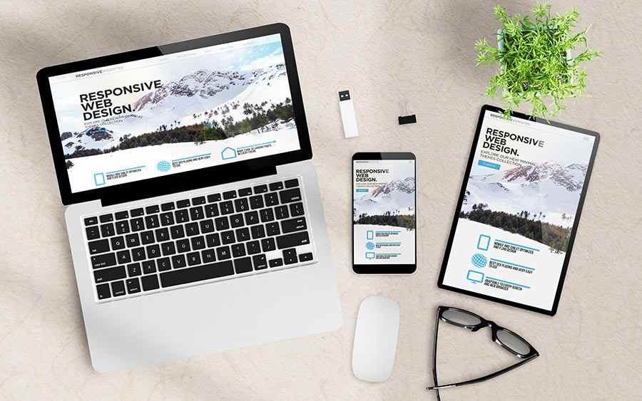
What is a responsive web design, you ask? Simply put, it’s a design approach that allows websites to adapt and respond seamlessly to different screen sizes and devices. Gone are the days when users had to pinch, zoom, and scroll endlessly just to view content on their smartphones or tablets.
With responsive web design, websites automatically adjust their layout, text size, images, and other elements based on the device being used. This ensures that visitors have an optimal viewing experience regardless of whether they’re browsing from a desktop computer or a tiny mobile screen.
One of the key principles behind responsive web design is fluid grids. Instead of fixed pixel-based layouts, designers use percentages or relative units to define element widths. This allows for flexible resizing without compromising on readability or usability.
Another important aspect is media queries – snippets of code that detect the characteristics of the user’s device (such as screen size) and apply specific styles accordingly. By using media queries effectively, designers can create breakpoints where certain elements rearrange themselves or hide altogether for improved mobile usability.
In essence, responsive web design aims to create a seamless user experience across all devices by eliminating frustrating inconsistencies in website appearance and functionality. Now that we’ve covered what it entails let’s dive into why businesses should embrace this powerful technique!
Responsive web design offers numerous benefits that can greatly enhance the user experience on your website. It ensures that your site looks and functions seamlessly across all devices, from desktops to smartphones and tablets. This means that visitors can easily access and navigate your content no matter what device they are using.
Another major advantage of responsive web design is improved search engine optimization (SEO). With a responsive site, you only need to maintain one URL, making it easier for search engines like Google to crawl and index your pages. This can lead to higher rankings in search results and increased visibility for your website.
Furthermore, responsive web design allows you to reach a wider audience by catering to users with different preferences and needs. By providing a consistent experience across devices, you increase the chances of attracting and retaining visitors who may switch between multiple devices throughout their browsing sessions.
In addition, implementing responsive web design can also save time and resources in the long run. Instead of having separate versions of your website for different screen sizes or devices, you can have one flexible design that adapts automatically. This reduces development time as well as ongoing maintenance efforts.
Investing in responsive web design is crucial in today’s digital landscape where mobile usage continues to rise. By prioritizing user experience through a seamless multi-device approach, businesses can stay competitive while delivering a superior online experience for their audience.
When it comes to responsive web design, there are various approaches that can be taken to ensure a seamless user experience across different devices. Let’s explore some of the different types of responsive web design that are prevalent in today’s digital landscape.
Adaptive Design: This approach involves creating multiple versions of a website tailored for specific device sizes or breakpoints. Each version is designed to provide an optimal browsing experience for users on different devices.
Fluid Grids: Fluid grids use relative units like percentages rather than fixed pixel values to adapt the layout of a website based on the screen size. This allows content and elements to resize proportionally, ensuring they fit well within any viewport.
Mobile-First Design: As the name suggests, the mobile-first design prioritizes designing and optimizing websites specifically for mobile devices before scaling up for larger screens. This approach ensures that all essential features and content are readily accessible on smaller screens without compromising usability.
Desktop-First Design: In contrast to mobile-first design, desktop-first design focuses on creating websites optimized for larger screens first and then adapting them for smaller ones. This approach may be suitable when targeting audiences who primarily access the internet via desktop computers or laptops.
Single Page Applications (SPAs): SPAs load only once during the initial visit and dynamically update as users interact with them, providing a smooth browsing experience similar to native applications. They eliminate page reloads and offer seamless navigation between sections or pages within a single webpage.
Progressive Web Apps (PWAs): PWAs combine the best aspects of both web pages and native apps by offering app-like functionalities such as push notifications, offline access, and home screen installation while retaining the flexibility and accessibility of traditional websites.
These are just a few examples of responsive web design approaches that designers can employ depending on their project requirements and target audience preferences. Experimenting with these techniques can help create engaging experiences across various platforms/devices ensuring maximum reachability for your business or brand online.
Now that we understand the benefits of responsive web design and the different types available, let’s dive into how to implement this powerful approach. Implementing responsive web design requires careful planning and attention to detail.
It is essential to start with a solid foundation – a mobile-first approach. This means designing your website with mobile devices in mind first and then scaling up for larger screens. By prioritizing the mobile experience, you ensure that your site will look great on any device.
Next, focus on flexible layouts. Use percentage-based widths instead of fixed pixel measurements so that elements can adapt to different screen sizes. Additionally, utilize CSS media queries to adjust styles based on specific breakpoints or screen resolutions.
Another crucial aspect is optimizing images for various devices. Large image files can slow down page load times and negatively impact user experience. Use responsive image techniques such as a src set or picture element with multiple versions of an image at different resolutions to ensure faster loading times without sacrificing quality.
Don’t forget about touch-friendly interactions! Consider incorporating features like swipe gestures or tap targets optimized for touchscreens to enhance usability on mobile devices. Always test your website across different devices and browsers throughout the development process. This ensures that everything looks and functions as intended across various platforms. By following these implementation tips, you’ll be well-equipped to create a seamless user experience across all devices!
Remember: Responsive web design is not just a trend; it’s becoming an industry standard as more users access websites from smartphones and tablets than ever before.
As we enter the exciting world of web design in 2023, it’s essential to stay ahead of the game and keep up with the latest trends. In this fast-paced digital era, user experience is paramount. With that in mind, here are some responsive web design trends to watch out for this year.
1. Dark mode: Dark mode has gained immense popularity over the past few years and shows no signs of slowing down. It not only looks visually appealing but also reduces eye strain and saves battery life on mobile devices.
2. Microinteractions: Interactive elements play a crucial role in engaging users and enhancing their overall experience. Microinteractions like hover effects, animated buttons, or subtle transitions add a touch of sophistication to your website.
3. Minimalistic approach: Clean and minimalistic designs continue to dominate the web design landscape in 2023. Simple layouts, ample white space, and clear typography create an aesthetically pleasing interface while ensuring easy navigation.
4. Keyframe animations: Dynamic animations can bring websites to life by adding movement and interactivity. Keyframe animations allow designers to create smooth transitions between different states or actions on a webpage.
5. Immersive scrolling experiences: Parallax scrolling provides an immersive experience by creating depth effect as users scroll through a page. This technique adds visual interest and keeps visitors engaged throughout their journey on your site.
6. Voice user interface (VUI) integration: As voice assistants become more prevalent, integrating VUI into responsive web design will be crucial in delivering seamless user experiences across various devices such as smart speakers or smartphones.
7. Mobile-first approach: With mobile usage surpassing desktops globally, designing with a mobile-first mindset is non-negotiable for any successful website today. Prioritizing responsiveness ensures optimal performance across all screen sizes and devices.
By embracing these responsive web design trends for 2023, you’ll not only enhance the user experience but also stay ahead of the competition. Remember, staying adaptable
Responsive web design is a powerful tool that allows websites to adapt and provide an optimal user experience across different devices. In today’s fast-paced digital world, it has become essential for businesses to invest in responsive web design to stay competitive.
By implementing responsive web design, businesses can reap numerous benefits such as increased mobile traffic, improved SEO rankings, reduced bounce rates, and enhanced user engagement. It ensures that users have a seamless browsing experience regardless of the device they are using.
When it comes to implementing responsive web design, there are various approaches available such as fluid grids, flexible images, media queries, and mobile-first design. Each approach offers its own set of advantages and considerations based on the specific needs of your website.
Looking ahead to 2023, several trends are expected to shape the landscape of responsive web design. These include incorporating advanced animations and micro-interactions for more engaging user experiences. Additionally, dark mode designs will continue to rise in popularity due to their sleek look and energy-saving properties.
Other notable trends include voice search optimization for better accessibility and integrating AI-powered chatbots for personalized interactions with users. Furthermore, designers will experiment with asymmetrical layouts and bold typography choices to create visually striking websites.
In conclusion, responsive web design is not just a trend but rather a necessity for any modern website looking to thrive in today’s digital age. By embracing these emerging trends while staying true to the core principles of responsiveness and usability, businesses can unlock the power of user experience on all devices. So why wait? Get started on your journey toward creating a truly dynamic website that caters seamlessly to every visitor!

Hire an SEO Expert For Roofers in Houston to Generate More Roofing Leads and Grow Your Roofing Business Faster

Get Local SEO for Auto Appraiser Services in Houston With Transparent Monthly Pricing From DBanerjee.com

Schedule SEO Services for Roofing and Construction in Houston with Clear Monthly Costs

Comparing Roofing SEO Monthly Pricing in Roseville: What an SEO Consultant for Roofer Delivers

Schedule a Commercial Roofing Website Redesign in Houston With a Specialist Who Understands Roofing SEO

How Much Does a Website Redesign for Auto Appraiser Cost in Los Angeles? A Practical Budget Guide

Start Your Roofing Website Redesign in Houston With a Clear Timeline and Quote