Call: 1-916-358-6449

Welcome to the digital era, where smartphones have become an extension of our very beings. From checking emails to scrolling through social media, we rely on our mobile devices for almost everything. And as a business owner or aspiring entrepreneur, you simply cannot afford to ignore this massive shift toward mobile usage. That’s why having a mobile friendly web design is not just important – it’s absolutely essential.
In today’s blog post, we’ll explore the world of mobile friendly web design and uncover its numerous benefits for your business. We’ll also provide you with some valuable tips on how to create a website that caters seamlessly to the ever-growing number of smartphone users. So grab your phone and get ready to level up your online presence!
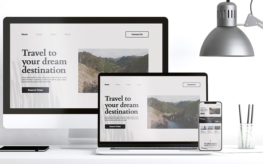
What exactly is mobile friendly web design? Simply put, it refers to the practice of creating websites that are optimized for viewing and interacting on mobile devices, such as smartphones and tablets. A mobile friendly website adjusts its layout, content, and functionality to provide an optimal user experience on smaller screens.
Gone are the days when people would primarily access websites through their desktop computers. With the rapid advancement of technology and the increasing affordability of smartphones, more and more users now browse the internet on their mobile devices. In fact, studies show that a significant portion of web traffic comes from mobile devices.
So why does your business need a mobile friendly website? Well, for starters, it’s all about user experience. Think about how frustrating it can be to navigate a non-mobile-friendly site on your phone – pinching and zooming just to read some tiny text or struggling to click on tiny buttons. A responsive website ensures that users can easily read your content, navigate through pages with ease, and interact with your site effortlessly.
But it’s not just about convenience for users; having a mobile friendly web design also has numerous benefits for your business itself. For one thing, Google loves responsive sites! The search engine giant considers mobile friendliness as a ranking factor in its search results. So if you want higher visibility in search engine rankings (and who doesn’t?), optimizing your website for mobile is crucial.
In addition to improved SEO performance, having a mobile friendly website also enhances your brand image. It shows that you care about providing an excellent user experience across all platforms and devices. This level of professionalism can help instill trust in potential customers and increase credibility for your business.
Now that we’ve established what exactly constitutes a mobile friendly web design let’s delve into some practical steps you can take to create one for yourself.
Mobile friendly web design offers numerous benefits for businesses in today’s digital age. With the increasing use of smartphones and tablets, having a website that is optimized for mobile devices is crucial.
A mobile friendly website improves user experience. It ensures that visitors can easily navigate through your site, view content, and complete desired actions such as making a purchase or filling out a form. A smooth browsing experience leads to higher engagement and increased conversion rates.
Implementing mobile friendly web design enhances your search engine optimization (SEO) efforts. Google has made it clear that mobile-friendliness is an important ranking factor. Having a responsive website will improve your visibility in search results, driving more organic traffic to your site.
Furthermore, having a mobile friendly website helps you reach a larger audience. A large percentage of internet users access the web primarily through their mobile devices. By catering to this segment of users with seamless navigation and accessibility on their preferred devices, you expand your potential customer base.
Additionally, having a well-optimized mobile site can also contribute to building brand credibility and professionalism. When visitors land on your site from their smartphones or tablets and have an enjoyable experience navigating through it effortlessly without any glitches or formatting issues, they are more likely to trust your brand.
In conclusion, mobile friendly web design offers several advantages for businesses looking to thrive in the digital landscape. By ensuring optimal user experience across all devices, boosting SEO performance, expanding reach, and enhancing brand credibility, a responsive website becomes essential for success in today’s competitive online world. Investing in creating a mobile-friendly website will undoubtedly yield long-term benefits by attracting more visitors and converting them into loyal customers or clients
Creating a mobile friendly website is crucial in today’s digital landscape. With the majority of internet users accessing websites through their mobile devices, it is essential for businesses to optimize their web design accordingly.
One of the first steps in creating a mobile friendly website is to ensure that your design is responsive. This means that your website will automatically adjust and adapt to different screen sizes, providing an optimal viewing experience for users on all devices.
Another important aspect to consider is the loading speed of your website. Mobile users tend to have shorter attention spans, so it is imperative that your site loads quickly. Optimize images and minimize code bloat to improve loading times.
Furthermore, make sure that your content is easily readable on smaller screens. Use legible fonts and appropriate font sizes to enhance readability. Avoid overcrowding the screen with too much information or elements that may be difficult to interact with on a touch-based device.
Additionally, take advantage of mobile-specific features such as click-to-call buttons or location-based services if relevant to your business. These features can greatly enhance user experience and drive conversions.
Regularly test your website across different devices and browsers to ensure compatibility and functionality. Conduct user testing sessions or gather feedback from visitors to identify any areas for improvement.
Creating a mobile friendly website involves optimizing design responsiveness, improving loading speeds, enhancing readability, utilizing mobile-specific features, and conducting regular testing for optimal performance across various devices and platforms.
Mobile friendly web design is crucial in today’s digital landscape. With more people accessing the internet through their mobile devices, it’s important to ensure that your website is optimized for a seamless mobile experience. Here are some tips to help you create a mobile friendly website:
1. Responsive design: Make sure your website layout adapts to different screen sizes and resolutions. This will ensure that users have a consistent and user-friendly experience across all devices.
2. Optimize images: Large image files can slow down loading times on mobile devices. Compressing and resizing images can help improve page load speed, enhancing the overall user experience.
3. Clear navigation: Simplify your website’s navigation menu for smaller screens. Use clear labels and minimize the number of clicks required to access key information.
4. Font size and spacing: Ensure that text is legible on smaller screens by using an appropriate font size and line spacing.
5. Avoid pop-ups: Pop-up ads or messages can be intrusive on mobile devices, leading to a poor user experience. Consider alternative ways to convey important information without disrupting the browsing process.
6. Test across devices: Don’t forget to test your website across various devices and platforms (iOS, Android) to identify any compatibility issues or responsive design glitches.
By implementing these mobile friendly web design tips, you can enhance user engagement, increase conversions, and ultimately boost your business’s online presence in this increasingly mobile-oriented world.
In today’s digital age, having a mobile friendly web design is no longer an option – it’s a necessity. With the increasing number of smartphone users and the growing importance of local search results, businesses cannot afford to ignore the needs of mobile users.
A mobile friendly website not only provides a better user experience but also improves your visibility in search engine rankings. By optimizing your site for mobile devices, you can attract more visitors, increase engagement, and ultimately drive more conversions.
To create a mobile friendly website, start by choosing a responsive design that adapts to different screen sizes. Optimize your images and use readable fonts to ensure easy navigation on smaller screens. Test your website on various devices and browsers to identify any issues or areas for improvement.
Remember these tips when designing your site: prioritize speed by minimizing loading times; simplify navigation with clear menus and buttons; optimize forms for touch input; and make sure all content is easily accessible without zooming or scrolling horizontally.
By implementing these strategies, you’ll be well on your way to creating an effective mobile friendly web design that will benefit both your business and its customers. Don’t miss out on this opportunity to stay ahead of the competition!
So why wait? Start prioritizing mobile friendliness today and watch as your business reaches new heights in terms of online presence, user satisfaction, and overall success!

Hire an SEO Expert For Roofers in Houston to Generate More Roofing Leads and Grow Your Roofing Business Faster

Get Local SEO for Auto Appraiser Services in Houston With Transparent Monthly Pricing From DBanerjee.com

Schedule SEO Services for Roofing and Construction in Houston with Clear Monthly Costs

Comparing Roofing SEO Monthly Pricing in Roseville: What an SEO Consultant for Roofer Delivers

Schedule a Commercial Roofing Website Redesign in Houston With a Specialist Who Understands Roofing SEO

How Much Does a Website Redesign for Auto Appraiser Cost in Los Angeles? A Practical Budget Guide

Start Your Roofing Website Redesign in Houston With a Clear Timeline and Quote