Call: 1-916-358-6449

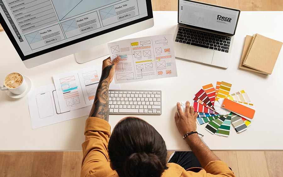
Welcome to the exciting world of web design! In this fast-paced digital era, staying ahead of the curve is crucial. With technology and user preferences constantly evolving, it’s essential for websites to keep up with the latest design trends. So buckle up and get ready to explore some of the Latest Website Design Trends that are shaping the online landscape today. From sleek minimalism to eye-catching cinematography, we’ve got you covered on all things trendy in web design. Ready? Let’s dive in and discover what’s new in the world of website aesthetics!
Flat design is a minimalist approach to web design that focuses on simplicity and clean lines. It emerged as a response to the overly embellished and skeuomorphic designs of the past. With flat design, gone are the days of heavy textures, shadows, and gradients. Instead, websites now embrace bold colors, crisp typography, and simple iconography.
One of the key advantages of flat design is its ability to load quickly. By eliminating complex visual elements and using straightforward graphics, websites can reduce their file sizes significantly. This not only enhances user experience but also improves search engine optimization by increasing page loading speed.
Another benefit of flat design is its responsiveness across different devices. With more people accessing websites through smartphones and tablets, it’s crucial for designs to adapt seamlessly to various screen sizes. Flat design excels in this aspect due to its focus on simplicity – the absence of intricate details ensures that visuals remain clear and legible regardless of device size.
Moreover, the flat design promotes intuitive navigation with an emphasis on clarity and hierarchy. By utilizing simple shapes and icons alongside concise text labels, users can easily understand site structure and find what they’re looking for without confusion or clutter.
Flat design offers a modern aesthetic that emphasizes simplicity while providing excellent usability across devices. Its minimalist approach not only enhances website performance but also provides an intuitive user experience that keeps visitors engaged from start to finish.
Minimalism in website design is all about simplicity and elegance. It’s a trend that has been gaining popularity in recent years, as more and more designers are embracing the less-is-more approach.
One of the key principles of minimalism is the use of white space or negative space. This empty space not only gives your website a clean and uncluttered look but also helps to draw attention to your content.
Another characteristic of minimalist design is the use of simple typography. Clean, sans-serif fonts are often favored over elaborate scripts or decorative typefaces. The idea is to let the words speak for themselves without any distractions.
In terms of color palette, minimalistic websites typically stick to a limited range of colors – usually neutral tones such as black, white, gray, and occasionally one or two accent colors. This restrained use of color adds to the overall sense of calmness and sophistication.
When it comes to navigation menus and buttons, minimalist designs often opt for simple icons or text-only options instead of flashy graphics. This makes it easier for users to navigate through your site without getting overwhelmed by unnecessary elements.
Minimalism in web design allows for a seamless user experience by eliminating distractions and focusing on what truly matters – your content! So why not embrace this trend and create a sleek and modern website that will leave a lasting impression on your visitors?
Material Design is one of the latest website design trends that has gained significant popularity in recent years. This design philosophy was introduced by Google, aiming to create a visually appealing and user-friendly experience across different platforms.
One of the key features of Material Design is its use of depth and movement. With a focus on realistic lighting and motion effects, this design style creates an immersive digital environment for users. The concept behind Material Design is to mimic real-world materials such as paper and ink, giving websites a tangible feel.
Another important aspect of Material Design is its emphasis on clean and simple aesthetics. The use of bold colors, large typography, and intuitive icons helps guide users through the interface effortlessly. Additionally, the consistent use of grids ensures that elements are organized neatly while maintaining visual harmony.
The responsive nature of Material Design makes it ideal for mobile-first approaches. Its adaptive layout allows websites to seamlessly transition from desktop screens to smaller devices without compromising functionality or visual appeal.
Material Design offers a fresh approach to web design by combining modern aesthetics with practical functionality. Its attention to detail and focus on creating delightful user experiences make it a trend worth considering when designing or revamping your website.
Mobile-First Design has become a crucial aspect of website development in recent years. With the majority of internet users accessing websites through their mobile devices, it is essential for designers to prioritize mobile optimization from the start.
One key element of Mobile-First Design is responsive web design. This means that websites are designed to automatically adjust and adapt to different screen sizes and resolutions. By ensuring that your website looks great and functions seamlessly on mobile devices, you can provide a positive user experience for your visitors.
Another important aspect of Mobile-First Design is load time optimization. Mobile users often have limited data plans or slower internet connections, so it’s vital to make sure that your website loads quickly on mobile devices. This can be achieved by optimizing images, minimizing code, and using caching techniques.
In addition, designing with touch-friendly elements in mind is crucial for Mobile-First Design. Buttons should be large enough to tap easily with a finger, and navigation menus should be simple and intuitive for touchscreen interaction.
By adopting a Mobile-First Design approach, you can ensure that your website remains accessible and engaging across all devices. With the increasing use of smartphones and tablets for browsing the web, staying ahead of this trend will give you an edge over competitors who neglect mobile optimization. So don’t wait any longer – embrace Mobile-First Design today!
Asymmetry is a design trend that breaks away from the traditional balanced layouts we are used to seeing. It adds an element of surprise and uniqueness to a website, making it stand out in a sea of symmetrical designs.
One of the key advantages of asymmetrical design is its ability to create visual interest and draw attention to specific elements on a page. By intentionally placing elements off-center or at varying sizes, designers can guide users’ eyes toward important content or calls-to-action.
Moreover, asymmetry allows for more flexibility in terms of creativity and expression. Designers can experiment with different combinations of shapes, colors, and textures without being constrained by rigid grid systems. This freedom encourages innovation and pushes boundaries in web design.
However, it’s important to strike the right balance when implementing asymmetry. Too much imbalance can lead to confusion or make a website difficult to navigate. Therefore, careful consideration must be given to maintain usability while still embracing this edgy design approach.
Asymmetry brings excitement and dynamism to websites by breaking free from conventional norms. Embracing this trend allows designers the opportunity to create visually captivating experiences that engage users in new and unexpected ways. So don’t be afraid to step outside the box and explore asymmetric designs for your next project!
Broken Grid Layouts have been gaining popularity in website design trends, challenging the traditional notions of symmetry and balance. This unconventional approach to layout involves intentionally breaking the grid structure, resulting in a more dynamic and visually interesting design.
By embracing asymmetry, broken grid layouts create a sense of movement on the webpage. Elements are positioned at different angles and varying sizes, creating a unique visual hierarchy that captures users’ attention. This non-conformist style allows designers to play with different shapes and placements, giving websites a fresh and innovative look.
One advantage of using broken grid layouts is their ability to highlight specific content or elements. By strategically placing important information outside the traditional grid boundaries, designers can draw users’ focus directly to it. This technique helps prioritize key messages or call-to-action buttons for improved user experience.
Moreover, broken grid layouts offer flexibility in terms of responsiveness across different screen sizes. Asymmetric designs can adapt well to various devices without sacrificing aesthetic appeal or functionality. The dynamic nature of these layouts ensures that content remains engaging regardless of whether it’s viewed on a desktop computer or mobile device.
Despite its growing popularity among web designers, implementing broken grid layouts requires careful consideration and planning. In order to maintain usability and readability, designers must strike a balance between creativity and functionality. It’s essential to ensure that even with an unconventional layout, the website remains intuitive for users to navigate through easily.
In conclusion, broken grid layouts challenge traditional design principles by intentionally breaking away from symmetrical structures. With their asymmetric placements and varied sizing options, these dynamic designs capture users’ attention while highlighting important content. They also provide flexibility in responsiveness across multiple devices.
However, implementing this trend should be done thoughtfully to maintain usability alongside innovation. Overall, broken grids add an element of surprise and uniqueness to modern website design that can captivate users and encourage engagement.
When it comes to website design, every element counts. From color schemes to typography choices, each decision can impact how users interact with your site. One design trend that has gained popularity in recent years is the use of ghost buttons.
Ghost buttons are transparent or semi-transparent buttons that blend seamlessly into the background of a webpage. They typically have a thin outline and minimal text or icons inside. This minimalist approach creates a sleek and modern look that appeals to many designers.
One of the main advantages of using ghost buttons is their ability to draw attention without being overly intrusive. Their subtle appearance allows other elements on the page to take center stage while still providing clear call-to-action options for users.
Moreover, ghost buttons work well with various backgrounds and color schemes, making them versatile for different design styles and branding preferences. Whether your website has a simple monochromatic palette or vibrant gradients, ghost buttons can complement any aesthetic.
However, it’s important not to overuse ghost buttons on your site as they may become ineffective if used excessively. It’s best to strategically place them where they will have the most impact, such as on landing pages or alongside important content.
In conclusion, Ghost buttons offer an elegant and understated way to guide user interaction on websites. By incorporating this design trend into your web pages thoughtfully, you can enhance both aesthetics and usability for an overall improved user experience.
Cinemagraphs are a captivating and innovative addition to the world of website design. These mesmerizing images combine the elements of photography and video, creating an engaging visual experience for users.
Unlike traditional static images, cinematography adds movement to specific areas or elements within a photograph. This subtle motion grabs viewers’ attention and creates a sense of intrigue and immersion. It’s like stepping into a moment frozen in time, where only certain parts come alive.
The beauty of cinematography lies in its ability to tell a story without overwhelming the user with too much information. By focusing on one or two movements within an image, they strike the perfect balance between simplicity and dynamic content.
In terms of web design trends, cinematography offers a unique way to enhance the overall aesthetics and user experience. They can be used as eye-catching hero images on landing pages, background visuals on product pages, or even incorporated into blog posts to make them more visually appealing.
Furthermore, cinematography not only captures attention but also conveys emotions effectively. Whether it’s evoking nostalgia through waves crashing on a beach or emphasizing excitement with flickering city lights at night – these moving images have the power to evoke strong emotional responses from users.
With their ability to captivate audiences while conveying meaningful messages, it’s no wonder that cinematography has gained popularity among web designers around the globe. Incorporating this trend into your website can elevate its visual appeal and create memorable experiences for your visitors.
Chatbots have become an increasingly popular tool for businesses to improve customer service and streamline communication. These virtual assistants use artificial intelligence technology to interact with users in a conversational manner, providing instant responses and personalized assistance.
One of the key benefits of chatbots is their ability to provide 24/7 support. Unlike human operators who need breaks and sleep, chatbots are available round-the-clock to answer queries and address customer concerns. This can greatly enhance the user experience by ensuring prompt assistance at any time of day or night.
Moreover, chatbots can handle multiple conversations simultaneously, allowing businesses to efficiently manage large volumes of inquiries without overwhelming their staff. By automating repetitive tasks such as answering frequently asked questions or processing basic transactions, chatbots free up valuable time for employees to focus on more complex issues that require human intervention.
In addition to their practical advantages, chatbots also contribute to creating a more engaging and interactive website experience. Through natural language processing capabilities, they can engage users in meaningful conversations that feel personal and tailored specifically to their needs.
As technology continues to evolve, we can expect even more advanced features from chatbot systems. From voice recognition capabilities for hands-free interaction to seamless integration with other platforms like social media messaging apps, the possibilities are endless.
Incorporating a chatbot into your website design not only enhances customer satisfaction but also helps your business stay ahead of the curve in terms of current trends in website design. Embracing this innovative technology allows you to offer efficient support while delivering a personalized user experience – both crucial factors for success in today’s digital landscape.
In the dynamic world of website design, staying ahead of the curve is crucial to creating an engaging and visually appealing online presence. By embracing the Latest Website Design Trends, you can ensure that your website stands out from the crowd and captivates your audience.
From flat design to minimalism, material design to mobile-first design, incorporating these elements into your website can elevate its aesthetics and user experience. Embracing asymmetry and broken grid layouts adds a touch of uniqueness and creativity. Ghost buttons provide subtle yet effective call-to-action options, while cinematography brings life and movement to static visuals.
Moreover, chatbots are revolutionizing customer support by providing instant assistance and enhancing user engagement on websites. With their ability to mimic human conversation, chatbots offer personalized experiences that leave a lasting impression on visitors.
By exploring these latest website design trends, you have the opportunity to create a captivating digital space that not only looks great but also provides an exceptional user experience across different devices.
However, it’s important not to get caught up in following trends blindly. Remember that every business is unique with its own target audience and brand identity. While incorporating trendy elements can be beneficial, make sure they align with your overall brand strategy.
So take inspiration from these latest website design trends but always strive for originality and authenticity in presenting your brand online. Experimentation is key – don’t be afraid to try new things as long as they resonate with your target audience.
Now armed with knowledge about the latest website design trends, go forth confidently into the ever-evolving digital landscape! Stay ahead of the curve by continuously learning, adapting, and refining your web designs. Your users will thank you for it!

Hire an SEO Expert For Roofers in Houston to Generate More Roofing Leads and Grow Your Roofing Business Faster

Get Local SEO for Auto Appraiser Services in Houston With Transparent Monthly Pricing From DBanerjee.com

Schedule SEO Services for Roofing and Construction in Houston with Clear Monthly Costs

Comparing Roofing SEO Monthly Pricing in Roseville: What an SEO Consultant for Roofer Delivers

Schedule a Commercial Roofing Website Redesign in Houston With a Specialist Who Understands Roofing SEO

How Much Does a Website Redesign for Auto Appraiser Cost in Los Angeles? A Practical Budget Guide

Start Your Roofing Website Redesign in Houston With a Clear Timeline and Quote